Behavioral design in UI/UX: what it is, how to use it, and real examples


Behavioral design is a way of designing products around how people actually make decisions, drawing on psychology and behavioral economics. A product team picks a target action and makes it easier and more likely, while the choice stays with the user. One widely cited model, by Stanford researcher BJ Fogg, links each behavior to three things present at the same moment: motivation, ability, and a prompt. In UI/UX work, this turns into defaults, shorter flows, timely reminders, and visible progress.
This guide is for founders and product owners who see users sign up and then stop. It covers the models designers use, seven principles you can apply to screens, examples from Duolingo, Apple, and two of our own projects, the line where influence becomes a dark pattern, and six steps to apply all of it to your product.
What is behavioral design?
Behavioral design is an approach to product design built around one question: will people do the thing the product is for, and will they do it again? Traditional UX design makes an interface clear and easy to use. Behavioral design starts from a target behavior, such as finishing onboarding or logging a workout every day, and changes the product until that behavior happens more often.
It rests on research into how people really decide. Daniel Kahneman, who shared the 2002 Nobel Prize in economics, was recognized for research on how people's decisions may depart in systematic ways from what standard economic theory predicts, and how their judgment may rely on mental shortcuts. Richard Thaler, who received the 2017 prize, coined the term nudging, and the prize announcement notes that nudges may help people with self-control, for example when they save for a pension.
Behavioral design vs traditional UI/UX design
| Aspect | Traditional UI/UX design | Behavioral design |
|---|---|---|
| Main question | Can people understand and use this screen? | Will people take this action, and repeat it? |
| Starting point | Screens, flows, and user tasks | One target behavior and the metric that tracks it |
| Measure of success | Task completion, errors, and time on task | How often the behavior happens: activation, repeat use, and retention |
| Typical changes | Layout, navigation, visual hierarchy, and copy | Defaults, removed steps, prompts at the right moment, and progress feedback |
| Main risk | A product that is hard to use | A product that pushes people against their own interest |
Models behavioral designers use
Two models are a practical starting point for product work. The Fogg Behavior Model explains why a single action happens or fails, and the Hooked Model explains how a product becomes a habit. Use the first to fix a step where users drop off, and the second only when your product is meant to be used often.
The Fogg Behavior Model (B=MAP)
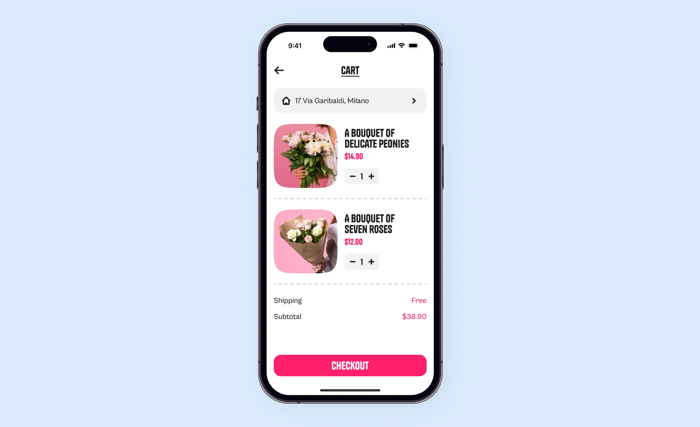
BJ Fogg, who founded the Behavior Design Lab at Stanford University, sums up his model this way: “Behavior happens when Motivation, Ability, and a Prompt come together at the same time. When a behavior does not occur, at least one of those three elements is missing.” A product team can use the model as a diagnostic tool. For each step where users stop, ask which element is missing:
- Motivation: the user does not yet see why the step matters. Show the value first, for example a preview of the result before the sign-up form.
- Ability: the step is too long, too hard, or asks for something the user does not have at hand. Remove fields, split the step, or fill in what you already know.
- Prompt: nothing asks the user to act at the right moment. Add a clear call to action on the screen, or a reminder when the user is likely to act.
The Hooked Model
Nir Eyal's Hooked Model describes a cycle of four phases. Something prompts the user to open the product (the trigger), the user does something in response (the action) and gets a reward that is not the same every time (the variable reward), and then puts in time, data, or effort that makes the product worth more to them (the investment). It fits products people are meant to open every day, such as social apps, learning apps, and team tools. For a product people use a few times a year, such as a tax filing tool, a daily habit is the wrong goal, and a short flow built with the Fogg model does more.
Seven behavioral design principles for UI/UX
Each principle below is a lever you can apply to a screen to make a target action easier or more likely. The same lever can also be misused to push users against their own interest, and that misuse is where a product loses trust.
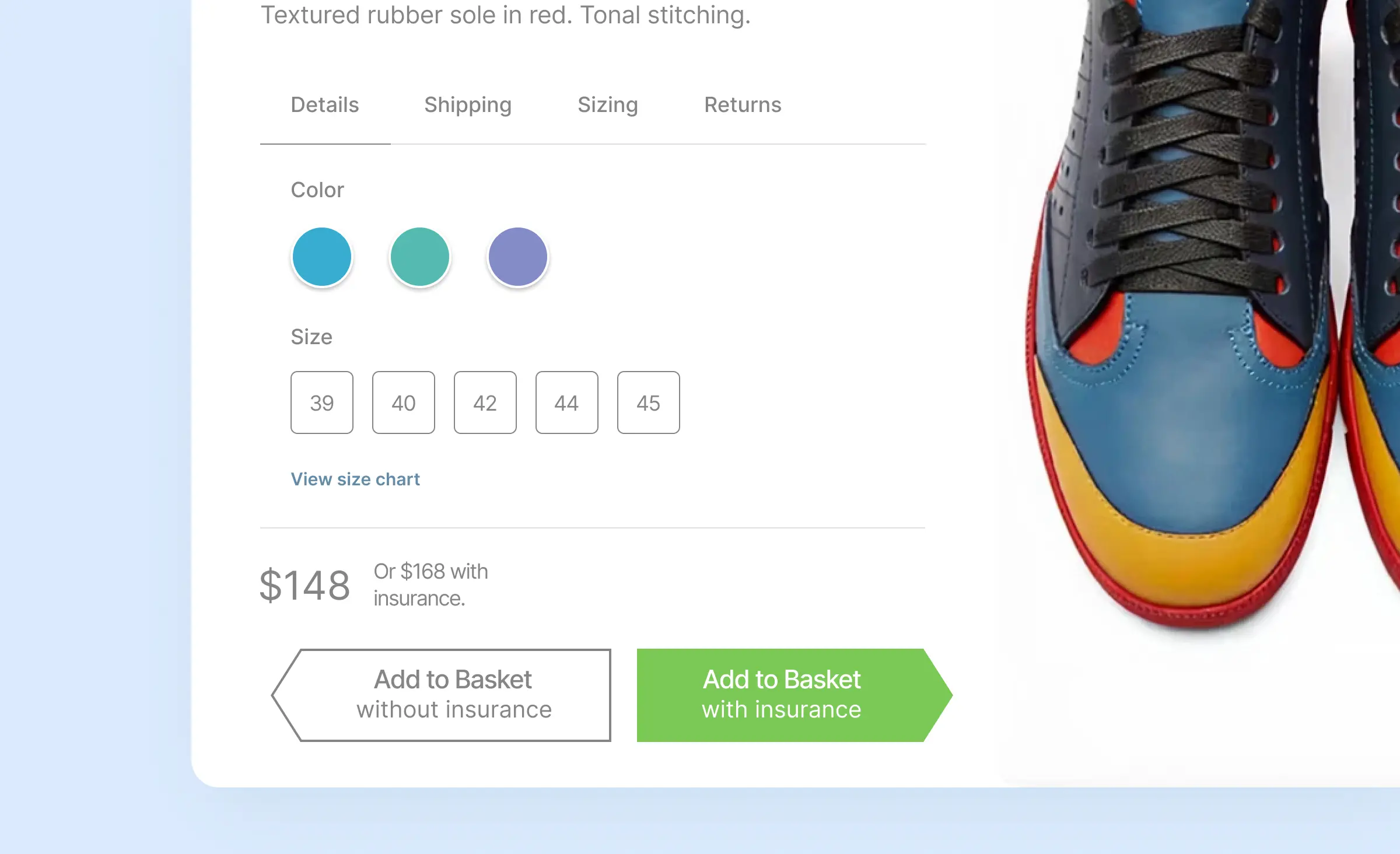
- Defaults: a pre-selected option is the path of least effort, so it decides for everyone who does not stop to compare. Pre-select what serves most users, such as a strong suggested password, and never pre-check a paid add-on.
- Friction: every extra field, screen, or decision is a reason to stop. Remove steps from the action you want, and keep a deliberate step only where a mistake is costly, such as a confirmation before a payment.
- Choice architecture: the order, grouping, and number of options change what people pick. Show a short list, mark one recommended option, and say why you recommend it.
- Social proof: people look at what others chose when they are unsure. Show real reviews, ratings, and usage, and only numbers you can back up.
- Loss aversion: people especially dislike losing something they already have, such as a streak or saved progress. Use it to protect progress the user built, and do not invent a loss, such as a fake countdown.
- Feedback and progress: a progress bar, a checkmark, or a short confirmation tells users that the action worked and how much is left. Without it, a user may tap again or leave, unsure whether the action went through.
- Timely prompts: a reminder works when it arrives at a moment the user can act on it. Too many interruptions can teach users to turn off notifications, and then the product loses the channel.
Behavioral design examples from well-known products and our design projects
Four examples show these principles at work: two from well-known products and two from projects our team designed. Duolingo uses a daily streak to keep learners practicing, and Apple's guidelines tell apps when and how to ask for permission. Waku Waku rewarded reviews, ratings, and discussions with points, and the onboarding of a habit-formation app asks questions that tailor habit recommendations.
Duolingo: a streak built on habit research
Duolingo's streak counts the days in a row a learner practices. In a 2022 post the company explains that it uses habit research to improve the streak, and that for long streaks it relies on loss aversion, “an internal bias in your brain that makes you particularly averse to losing something, like a learning streak.” The post reports two measured changes. A new animation after a learner extends the streak increased the likelihood that a brand-new learner was still using the app 7 days later by 1.7%. Letting learners equip up to two Streak Freezes at a time, which pause the streak for a day, increased the relative number of daily active learners by 0.38%.
Apple: permission requests that explain themselves
Apple's Human Interface Guidelines on privacy ask apps to request permission only when the app clearly needs access, ideally when a person starts to use a feature that requires it. If an app shows its own screen before the system alert, that screen should have one button with a title like “Continue” or “Next”: Apple warns that a button that does not open the alert, or a button titled “Allow,” can make people feel manipulated. For tracking requests, Apple notes that people “sometimes tap quickly to dismiss alerts without reading them,” and App Store review rejects apps whose custom screen uses this habit to influence the choice. Here, good timing and honest copy do the work that pressure does in a dark pattern.
Waku Waku: an anime community built around contribution
For Waku Waku, an IMDb-like app for anime fans, we designed and developed the mobile and web apps. The client wanted to attract users through gamification, so the design used feedback and progress to reward contribution: users earned Waku points for writing reviews, rating series, and joining discussions; points raised the account level, and the users with the most points competed on a leaderboard. The watchlist applied the same principle to viewing and showed progress on each saved title. Search reduced friction for users who could not recall a title: it found episodes by quotes and key events.
A habit-formation app: onboarding that sets the path
For a UK client's habit-formation app, our team did the UI/UX design. The app had not been released when its case was published, and development was planned as the client's next phase. The design work focused on onboarding: the answers users give there tailor the habits the app offers, and these recommendations are meant to change as the user changes. For feedback and progress, the design has short week overviews and three-day streak notifications.
Where behavioral design turns into dark patterns
Behavioral design becomes a dark pattern when the product pushes users toward a choice that serves the business and works against the user. The U.S. Federal Trade Commission's 2022 staff report, Bringing Dark Patterns to Light, focuses on four common tactics:
- Misleading consumers and disguising ads: for example, a countdown timer that suggests an offer ends soon when it does not.
- Making it difficult to cancel: a subscription or charge that is easy to start and hard to stop.
- Burying key terms and junk fees: limits hidden in dense terms, or mandatory fees shown only late in the purchase.
- Tricking consumers into sharing data: choices designed so that people give away more personal data than they meant to.
In the EU, Article 25 of the Digital Services Act says providers of online platforms shall not design their interfaces in a way that deceives or manipulates their users. The Act has applied in full since 17 February 2024. The article also says the Commission may issue guidelines on practices such as making it harder to end a service than to subscribe to it. Under Article 19, providers that qualify as micro or small enterprises are exempt from Article 25 unless they are designated as very large online platforms, so whether it applies to your product is a question for a lawyer. The design side of the line looks like this:
| Lever | Ethical use | Dark pattern version |
|---|---|---|
| Default | Pre-select the plan most users need | Pre-check a paid add-on or data sharing |
| Urgency | Show a deadline that is real | Run a countdown on an offer that does not end |
| Cancellation | Cancel in about as many steps as it took to subscribe | Hide the cancellation path behind promotions and extra pages |
| Permission request | Ask when a feature needs access and explain why | Show a screen that pushes people to allow before they see the real choice |
| Social proof | Show real reviews and ratings | Show invented counts or badges |
A simple test before release: would the user still choose this option if they saw exactly how the screen was built to steer them? If the answer is no, the pattern works against the user.
The test gets harder when an AI model writes the nudge. A model can choose the wording, the offer, and the moment for each user separately, so no designer sees every version before it ships. In the EU, Article 5 of the AI Act has prohibited, since 2 February 2025, AI systems that use purposefully manipulative or deceptive techniques, or exploit vulnerabilities due to age, disability, or a specific social or economic situation, when they materially distort a person's behavior in a way that causes or is reasonably likely to cause significant harm. If your product lets a model personalize prompts or offers, write down which levers it may use and which it may not, review samples of what it generates, and ask a lawyer where your case falls.
“Judge a behavioral change by what users do weeks later, not by the first click. Pressure can win that click and still lose the customer.”
Roman Surikov, CEO at Ronas IT
How to apply behavioral design to your product
Start from one behavior and one number, and change as little as possible at a time. Our projects begin with a written kickoff plan that lists the metrics that will count as success, and a behavioral change needs the same thing before any screen is drawn.
- Name the target behavior. Write it as an action and a time frame, such as “a new user completes the first lesson on day one,” and pick the metric that tracks it.
- Find where users stop. Look at the funnel in your product analytics, at session recordings, and at support tickets to find the step with the biggest drop.
- Diagnose the step. Ask which Fogg element is missing there: motivation, ability, or a prompt.
- Design the smallest change. Pick one lever from the seven principles, such as a better default, a removed field, or a reminder at the right moment.
- Test it before development. Put the change into a clickable prototype and watch a few users go through it. Our guide to interactive prototypes and user testing explains how.
- Ship and measure. Compare the metric before and after, with an A/B test where your traffic allows it, and track counter-metrics such as notification opt-outs, cancellations, and support tickets.
“A nudge that looks helpful on a single mockup can feel pushy on a real screen, next to everything else the user is trying to do there. Judge each nudge inside the full flow where it will appear.”
Elizaveta Denisova, Lead designer at Ronas IT
What behavioral design costs at Ronas IT
Behavioral design is part of our UI/UX design services, so the cost depends on the design work your product needs. If the product is already live and you do not know which steps to fix first, a UX audit starts from $500 and takes from 3 days: it goes through the key flows and ranks the problems by how much they cost you in users and conversions. A product redesign starts from $2,500, with a timeline from 1 week, and begins by checking how the current product looks and how easy it is to use before the key screens change. For a new product, the full design starts from $2,000 whatever the platform, and grows with the number of screens and their complexity.
Project management is part of each of these prices. Building the changes in your code is estimated separately, by their scope. A clickable prototype like the one in step 5 can be part of the design work if you ask for it, and it can be exported as a web page that your test users open from a link; the sessions with users are run on your side. In Figma, each of our designers works with an AI agent that has access to the file and can both read and edit it. The agent helps with the design itself, from components and type to the UI kit and the user flow, while the designers direct it and decide on the flow and the behavior it should support. Each design handoff includes a DESIGN.md file with the colors, fonts, and spacing written down for developers and their AI coding tools. Design work usually runs in sprints of one to three weeks, each ending in something you can open, such as updated mockups.
What to do next
- Take one behavior that matters to your business through the six steps above.
- Check your flows against the four FTC tactics, starting with how a user cancels.