Enterprise UX and UI design: best practices for complex apps and data dashboards

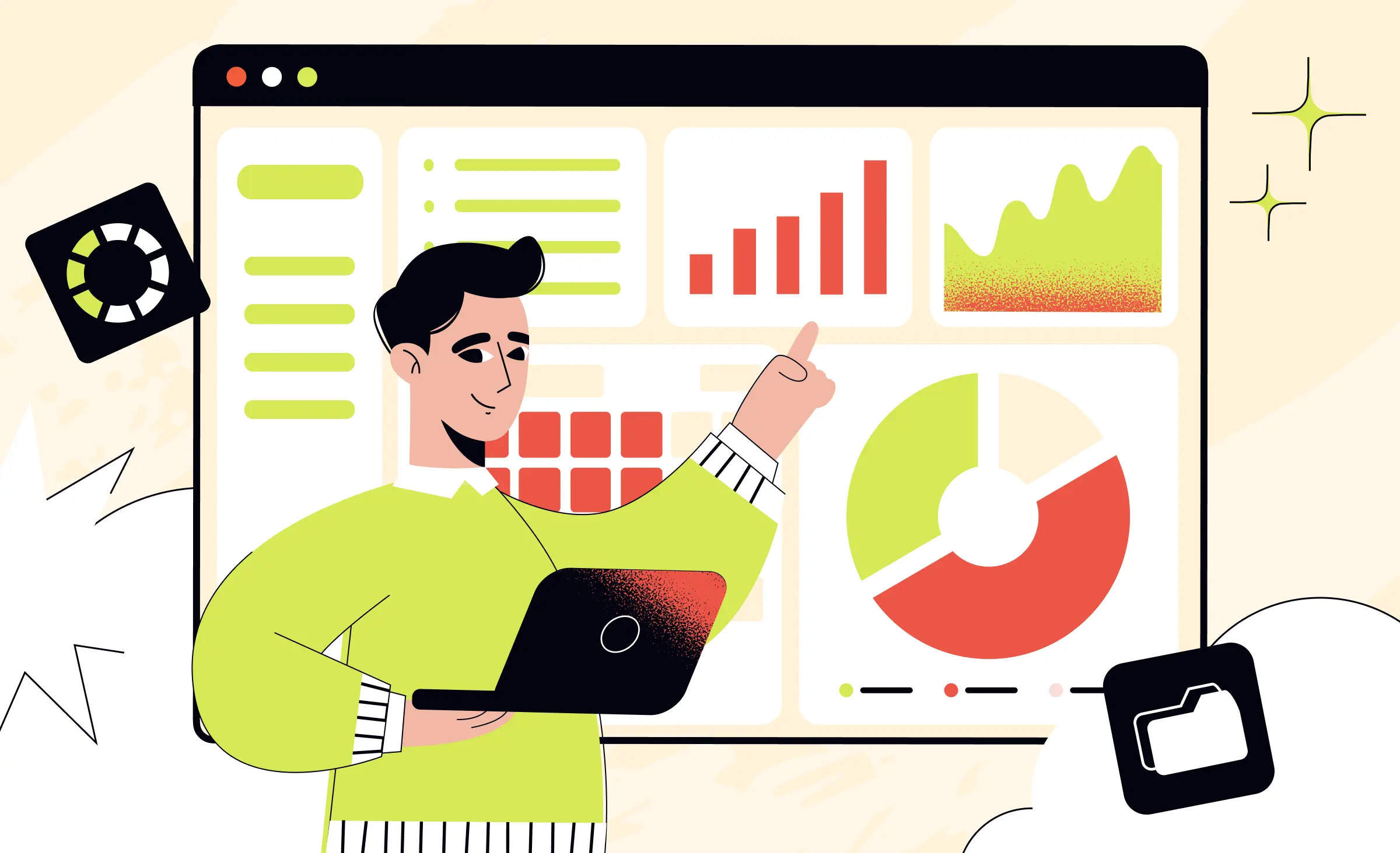
Enterprise user experience (UX) design is the design of software that a company provides to its staff for their work, such as admin panels, CRM and ERP systems, and internal dashboards. At Ronas IT, UI/UX design for a new internal system starts from $2,000 and grows with its roles and screens, and a redesign of an existing product starts from $2,500. Good enterprise UX lets each role finish its frequent tasks quickly and without errors, and it stays consistent as the system grows.
We wrote this guide for product owners and operations leads who plan a new internal system or want to fix one that staff avoid. It covers what makes enterprise interfaces different, the practices that matter most for screens and dashboards, how the design work runs, what it costs, and how to choose a design partner.
What makes enterprise UX different from consumer UX
The main difference is who chooses the software. A consumer picks an app and leaves it when it is hard to use. An employee gets a system from the company and works in it for hours.
| Question | Consumer app | Enterprise system |
|---|---|---|
| Who chooses it | The user | The company, not always the people who use it |
| How it is used | When the user wants to | As part of the job, the same tasks many times a day |
| Users | One broad audience | Several roles with different tasks and permissions |
| Data on screen | A few items at a time | Large tables, many filters, data from other systems |
| Measure of success | Sign-ups, retention, purchases | Task time, errors, training time, adoption |
Because staff cannot simply leave, weak enterprise UX shows up in other ways: slow task times, the same support questions every week, and data that someone has to correct later. Users also bring habits from the tools they know: the usability heuristics of Nielsen Norman Group describe this as Jakob's Law, the idea that people spend most of their time in products other than yours, and those products set their expectations. For an internal system, that other product can be the old system and the spreadsheet next to it. If you already run a system with these signs, a UX audit shows where people get stuck before you plan changes.
Enterprise UX best practices for complex applications
The practices that matter most in enterprise applications are to design around roles and tasks, make frequent tasks fast, show the core first, build tables for the tasks people do with records, prevent errors, keep one design system, and design for accessibility. They follow from what enterprise users do all day: they find records, change them, and act on them, sometimes in a system shared by several roles.
Design around roles and tasks
List the roles of the system and the three to five tasks each role does most often, and design those paths first. A screen that tries to serve every role shows each of them too much. Role-based views give each person the actions and data their work needs and hide the rest. The test: can a new user in each role find their main task on the first screen they see?
In a locker admin platform we designed and built for a European beauty retailer, one web panel served two roles. Store managers assigned lockers to online orders and marked pick-ups as complete. Administrators at headquarters saw every boutique, ran remote diagnostics, and managed the integration APIs. A header on every screen showed which location or locker network the admin was managing, and tabs switched between roles and sections.
Make frequent tasks fast
An enterprise user repeats the same task many times a day, so every extra click is multiplied. The heuristic of flexibility and efficiency describes shortcuts, hidden from novice users, that speed up the work of experts, and asks designers to let users tailor frequent actions. In an enterprise system that usually means four things:
- Keyboard shortcuts: for the most common actions, plus a full keyboard path through every form.
- Bulk actions: select many rows and change their status, owner, or date in one step.
- Saved filters and views: the user opens the list they need instead of building it again every morning.
- Smart defaults: a form fills in the values it can predict, such as today's date or the user's own team.
Show the core first and reveal the rest
Enterprise systems need depth: advanced settings, rare exceptions, and fields that only one role uses. Progressive disclosure moves advanced or rarely used features to a secondary screen, which, as Jakob Nielsen wrote in 2006, makes applications easier to learn and less error-prone. Keep the main form short, put rare options in a side panel or behind a clear “More options” control, and do not hide anything a role needs every day.
Build tables for the four table tasks
Tables are present in many workplace applications because they show a large data set compactly. Nielsen Norman Group names four tasks that table design should support: finding records that fit specific criteria, comparing data, viewing, editing, or adding a single row, and taking actions on records. Check each of your main tables against them:
- Find: search, filters on the fields people actually use, and sorting on the columns that matter.
- Compare: a fixed header on long tables, numbers aligned to the right, and the option to hide columns.
- View and edit: a row opens in a side panel, so the user keeps the list in view.
- Act: row and bulk actions sit where the user looks, with a confirmation for anything that deletes data.
Prevent errors instead of explaining them
A mistake in an enterprise system can mean a wrong payment or a lost order, and someone has to find and fix it. The error prevention heuristic says to either remove error-prone conditions or check for them and ask users to confirm before they commit to the action. Check values as the user types, block impossible values, and offer undo where an action is easy to reverse. When an error does happen, the message should say in plain language what went wrong and suggest a fix, with no error codes.
Keep it consistent with a design system
Consistency means the same action looks and works the same way on every screen, so users learn it once. The consistency heuristic puts it this way: users should not have to wonder whether different words, situations, or actions mean the same thing. In a system with dozens of screens built over years, that takes a design system: one set of components, styles, and rules that designers and developers both use.
At Ronas IT, every project file starts as a copy of our company design system, which the designer adapts to the product. Colors, type, and spacing are stored as Figma variables, and modes switch a design between contexts such as light and dark themes. Spacing follows a fixed scale from 2 to 240 pixels, and each component keeps its states as variants, so a screen that needs another version gets a new variant instead of a one-off change on that screen. A change to the kit can then be carried to every screen that uses it, and your developers and future designers work from the same library.
“I see a design system as a set of answers to questions the team would otherwise argue about on every screen: how a table sorts, what an empty list says, where a delete button lives. When those answers are written down once, designers spend their time on the hard screens.”
Alexander Kontsevoy, Art Director at Ronas IT
Design for accessibility from the start
Enterprise users include people with low vision or color blindness and people who work only from a keyboard. Aim for level AA of WCAG 2.2, the W3C accessibility guidelines. Four of its criteria matter most on screens full of data:
- Keyboard (level A): every function works from a keyboard, except input that depends on the path of the user's movement.
- Contrast (level AA): text has a contrast ratio of at least 4.5:1, or 3:1 for large text.
- Use of color (level A): color is not the only way to show a status, so add an icon or a label.
- Focus visible (level AA): when someone works from the keyboard, they can see which element has focus.
Enterprise dashboard design: making data readable
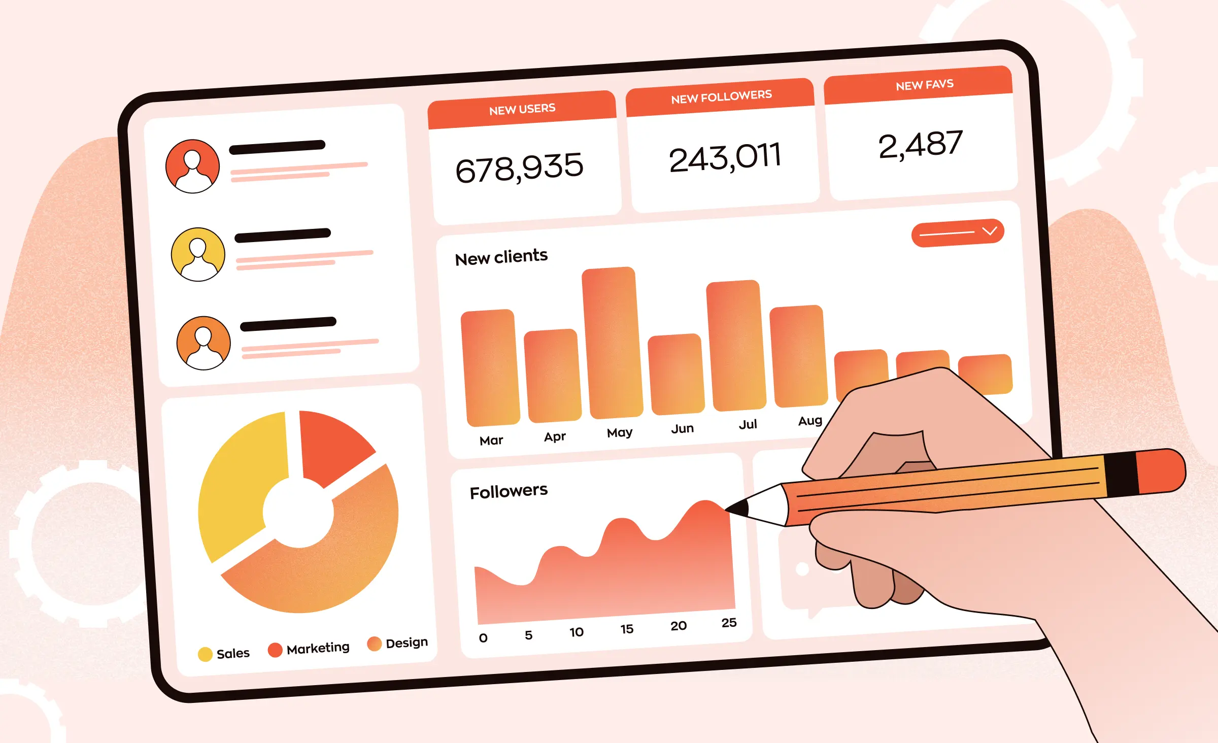
A good enterprise dashboard answers the questions of one role and leads to an action. Nielsen Norman Group defines a dashboard as a collection of data visualizations in a single-page view that gives at-a-glance information users can act on quickly. Before any layout, decide which of the two kinds of dashboard you are building.
Operational and analytical dashboards
- Operational dashboards: give critical information quickly to people doing time-sensitive work, such as monitoring server availability or customer-service calls.
- Analytical dashboards: support analysis and decisions without the same time pressure, so they can hold trends and comparisons.
Rules for the dashboard screen
- Key metrics first: the numbers the role checks every day sit at the top, and everything else is secondary.
- Charts that match the question: people read length and 2D position quickly, so bar and line charts work for amounts and trends. Pie charts, donuts, and gauges rely on area and angle, which are harder to compare.
- Color for status, not amounts: people do not see colors in a natural order, so color should not show how large a value is.
- A path from every number: clicking a metric opens the list of records behind it, where the user can act.
- Filters that match the work: by region, team, or period, the way the role already thinks about its data.
We designed and built a dashboard for the internal team of a cybersecurity company. The design goal was a simple interface that helps employees find important information quickly. Employees could filter the data by group or country, charts showed trends in attack damage and case counts, and a table gave the details of each incident. The dark theme with bright green highlights kept the key data visible at a glance. Its filters by group and country follow the rule above: they match how the team already thinks about its data. For layout and chart types in more depth, see our guide to dashboard UI design.
How the enterprise UX design process works
The work moves from roles and tasks to reviewed screens, a UI kit, and a prototype your users can try. At Ronas IT, design runs in sprints, and a sprint usually takes one to three weeks. You can open the result of every sprint, such as mockups or an interface ready to test.
- You share the context: the roles, the business processes the system must support, the current system or spreadsheets, and any analytics or support data.
- The designer maps roles and tasks: who does what, how often, and where the current process breaks. Watching people do their real work shows steps nobody mentions in a meeting.
- The designer sets the concept and maps the features: a few key screens in the proposed style for your approval, then a product map of the features, the data each one needs, and how they link, so the scope is agreed before the full interface is drawn.
- The designer creates the UI and the UI kit: the screens in scope, with the empty, loading, and error states agreed for them, and every component in one library.
- Another designer reviews each part: this happens after the designer's own check against a written quality checklist and before the part comes to you for approval.
- Your users from each role try a prototype: you run these sessions on your side, and a clickable version of the main flows shows where people hesitate while changes are still cheap. Our article on interactive prototypes and user testing shows how to run these sessions.
- Developers build from the design: front-end developers work directly with our designers, so the built screens match the design. The handoff also includes a DESIGN.md file in the repository that AI coding agents read to keep new screens in the same style.
Design changes are shared with the client as they happen, since even a minor edit to a mockup can change the development work.
Replacing a legacy system
When the new system replaces an old one, the old one is where users learned their work. Keep the terms they know unless those terms are wrong, map every task from the old system to its new place, and release module by module where the process allows it.
“While a new system replaces the old one in stages, some new screens can still read data from the old system, or from a spreadsheet someone keeps updating. I ask the designer to draw what those screens show when that data is late or wrong. Users will meet that state in their daily work, so it needs a design as much as the normal one does.”
Evgeny Leonov, CTO at Ronas IT
What enterprise UX design costs at Ronas IT
The design of a new internal system starts from $2,000, whichever platform staff use it on. That starting price fits a tool with few roles and screens, and an admin panel or a system with many roles is priced by how many flows and screens it has and how complex they are. You get structured design files with a UI kit. A redesign begins with a review of how usable the current product is.
| Work | Starting price | Timeline | When it applies |
|---|---|---|---|
| Design of a new system | From $2,000 | At least 1 week | A new internal system or admin panel |
| Product redesign | From $2,500 | At least 1 week | An existing system that staff struggle with |
| UX audit | From $500 | From 3 days | A live system where you need to know which flows to fix first |
These prices are for design without development. If we also build the system, the design is part of the development price. An internal portal, a CRM, or a reporting dashboard built as custom business software starts from $15,000, with a timeline of at least 6 weeks, and that price already covers its admin panel and the connections to systems you run, such as an ERP or an HR tool. A system at the scale of an ERP starts from $60,000. Project management is included in every price here, design-only work as well. After launch, support for the whole system, with monitoring, fixes, and updates, starts from $2,000 per month; new features are estimated separately.
From these starting prices, two parts of the scope move the cost:
- Roles: each role has its own tasks and views to design.
- Flows and screens: the number and complexity of the screens in scope.
Three rounds of concept revisions are part of each design price by default, and the count is agreed with every client, so the figures above are minimums. If your company already runs its own design system, it can cut the cost in rare cases: we review it first, and it usually changes as the work goes on, since components drawn without the real screens of a product leave gaps.
How to choose an enterprise UX design partner
Choose a team that can show enterprise work with several roles and dense data, and whose designers work with the developers who will build the system. Ask these four questions on the first call and compare the answers from each team you talk to:
- “Show me a screen you designed for two roles.” Listen for how they split tasks and permissions, not only for how the screen looks.
- “How do you design tables and bulk actions?” A good answer covers finding, comparing, editing, and acting on records.
- “Who reviews a screen before we see it?” Expect a named step, such as a checklist and a second designer, not “the designer double-checks.”
- “What do we get at handover?” Expect design files, a UI kit, and a DESIGN.md file your developers' AI coding agents can build from, all usable without the agency.
What to do next
- Write down each role and its three to five most frequent tasks.
- Pick the task that costs the most time today and watch a real user do it.
- Check your main tables against the four table tasks: find, compare, view and edit, act.
- Decide whether you need a new design or a redesign of the current system.
- Ask each design partner the four questions above.



Frequently Asked Questions (FAQs)
What is enterprise UX design?
It covers the software a company's employees use for their work: admin panels, CRM and ERP systems, internal portals, and data dashboards. It plans how each user role moves through its tasks, how large amounts of data appear on screen, and how the interface stays consistent as the system grows. The goal is less time and fewer errors on the work people repeat every day.
How is enterprise UX different from consumer UX?
In consumer software, the user chooses the app and leaves when it is hard to use. In enterprise software, the company chooses the system, and employees use it for hours as part of their job. So enterprise design serves several roles in one product, handles large tables and data from other systems, and is judged by task time, errors, and training time instead of downloads.
What are the best practices for enterprise UI design?
Design around roles and their most frequent tasks. Add shortcuts, bulk actions, and saved filters for daily work. Show the core of each screen first and move rare options to a secondary view. Build tables so users can find, compare, edit, and act on records. Prevent errors with checks and confirmations, keep one design system across screens, and meet WCAG 2.2 level AA for accessibility.
What makes a good enterprise dashboard?
A good dashboard serves one role and one kind of decision. It puts that role's key metrics first, uses bar and line charts for amounts and trends, and does not rely on color alone to show values. Each metric opens the records behind it, and the filters match how the role thinks about its work, such as by region, team, or period.
Does an enterprise application need a design system?
Yes, once the product has more than a few screens or more than one team working on it. A design system gives designers and developers one shared library of components, styles, and rules. Without it, the same action starts to look different in each module, and users have to learn the product again in every section.
How long does enterprise UX design take?
At Ronas IT, both designing a new internal system and redesigning your current product take at least 1 week. The real length depends on the number of roles, the flows in scope, and whether you test prototypes with users. A system with five roles and many tables takes longer than an admin panel for one team.
How much does enterprise UX design cost?
At Ronas IT, the design of a new internal system on its own starts from $2,000 and grows with the number of roles, flows, and screens. A redesign of a system staff already use starts from $2,500 and opens with a usability review, and a UX audit of its key flows alone starts from $500. When we also build the system, the design comes with the build: custom business software such as a CRM, an HRM tool, or an analytics dashboard starts from $15,000, and an ERP-scale system from $60,000. Project management is part of every one of these prices, and the build price also covers the integrations with your other systems.
How do you redesign a legacy enterprise system without disrupting users?
Start from the tasks people do in the old system and keep the terms they already know, unless those terms are wrong. Test the new flows with users from each role before development. Release module by module where the process allows it.